
In the world of art book printing, nothing is more disheartening than receiving a batch of books marred by quality issues. Banding streaks across vibrant gradients, weak bindings that threaten to fall apart, and colors that fail to capture the artist’s intent—these problems can turn an exciting project into a nightmare. At ArtBook Printing, we’ve seen it all, and we’ve built our reputation on rescuing projects gone wrong with other printers.
This post shares a real-world case study (with details anonymized for privacy) of how we helped an emerging photographer salvage a limited-edition art book after a disappointing run with a previous printer. We’ll break down the common causes of banding, binding failures, and color inaccuracies in art book production, explain our diagnostic process, and detail the solutions that transformed a flawed print run into a stunning success. If you’re facing similar challenges—or want to avoid them altogether—this guide will arm you with the knowledge to achieve professional results.
Art books demand precision. High-resolution images, rich colors, and durable construction are non-negotiable for portfolios, monographs, and collector’s editions. Yet, shortcuts in printing techniques or inadequate quality control often lead to preventable defects. By partnering with specialists like us, artists can reclaim control and deliver books that truly honor their work.
The Problem: A Disappointing First Print Run
Our client, a talented fine art photographer, approached us in frustration. Their 750-copy limited-edition book—featuring landscape photographs with subtle gradients and deep shadows—had just arrived from another printer. The issues were immediately apparent:
- Visible banding in sky gradients and smooth tonal transitions, creating unsightly horizontal or vertical lines that disrupted the serene imagery.
- Poor binding quality, with pages pulling away from the spine and the book refusing to lay flat, especially on double-page spreads.
- Color mismatches, where prints appeared muted, overly dark, or with unwanted shifts (e.g., blues turning greenish or skin tones off-balance).
These defects not only compromised the book’s aesthetic but also its perceived value as a premium product. The client had invested significant time and money, only to face the prospect of unusable inventory.
Common in lower-cost or rushed productions, these problems often stem from mismatched equipment, improper file preparation, or skipped proofing stages.
Diagnosing the Issues: Banding
Banding—those annoying lines or streaks in gradients—is one of the most frequent complaints in art book printing. It occurs when ink distribution is uneven, often due to printer settings, hardware limitations, or file issues.
In our client’s case, horizontal banding appeared in large gradient areas, likely from bi-directional printing mode (high-speed setting) or insufficient print resolution on a digital press not optimized for fine art.
Causes include:
- Clogged nozzles or inconsistent ink flow.
- Low-quality modes prioritizing speed over precision.
- Mismatched media settings or incompatible inks/paper.
We confirmed this by reviewing sample pages and the original files.
Diagnosing the Issues: Binding Problems
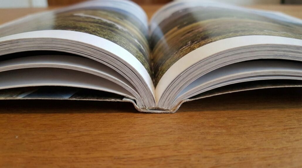
Binding failures are particularly damaging in art books, where viewers expect books to open flat for full-spread viewing.
The client’s perfect-bound (glue-only) book showed pages loosening and gutter loss (art disappearing into the spine curve).
Common culprits:
- Inadequate glue application or cheap adhesives that don’t flex.
- Thick, heavy art paper straining the bind.
- No reinforcement like sewn signatures for durability.
Hardcover art books often suffer more if the case isn’t properly grooved.
Diagnosing the Issues: Color Inaccuracies
Color shifts are the silent killer of art reproduction. The client’s prints were duller than expected, with lost detail in shadows and inaccurate hues.
Root causes:
- RGB files not properly converted to CMYK without calibration.
- Lack of ICC profiles matching the printer’s setup.
- No physical proofing—relying on screen previews alone.
Screens (RGB) glow with light, while prints (CMYK inks) absorb it, leading to inevitable differences without proper management.
Our Rescue Plan: Step-by-Step Solutions
At ArtBook Printing, we manage the entire process, from file audit to final delivery. Here’s how we fixed this project:
- File Audit and Preparation:
- Converted all images to CMYK using custom ICC profiles for our offset presses.
- Adjusted curves and levels for print-optimized vibrancy.
- Ensured 300+ DPI resolution and proper bleeds.
- Eliminating Banding:
- Switched to high-quality offset printing (superior for gradients over digital).
- Used unidirectional printing modes and premium coated papers for even ink laydown.
- Applied screening techniques to minimize artifacts.
- Upgrading Binding:
- Recommended Smyth-sewn binding with lay-flat glue for durability and full opens.
- Reinforced with headbands and quality endpapers.
- Chose hardcover with proper spine grooving.
- Perfecting Colors:
- Created calibrated hard proofs on actual stock.
- Iterated based on client feedback until matches were spot-on.
- Incorporated G7 color standards for consistency.
- Proofing and Production:
- Multiple proof rounds (digital then physical).
- Full run on calibrated equipment with on-press checks.
The result? A reprinted edition that exceeded expectations—vibrant colors, no banding, and bindings that held strong.
Lessons Learned: Preventing These Issues in Your Project
While we love rescuing projects, prevention is better:
- Always request physical proofs.
- Work in CMYK or use printer-provided profiles.
- Specify binding types suited to page count and paper weight.
- Choose printers experienced in fine art reproduction.
- Budget for quality—cheaper often means compromises.
In 2026, with advanced calibration tools and eco-friendly inks, achieving flawless art books is easier than ever.
Why Choose ArtBook Printing for Your Next Project?
We’ve rescued dozens of art books from similar fates. Our end-to-end management includes expert consultation, rigorous proofing, and premium materials—all tailored to artists’ needs.
Don’t let printing problems dim your vision. Contact us for a free quote and consultation.