

Introduction: The High Stakes of the First Print Run
There is no feeling quite like opening that first box of books from the printer. For many artists, it’s a moment of pure triumph. But for some, that excitement turns to heartbreak when they realize the colors are too dark, the text is too close to the spine, or the images look pixelated.
At ArtBook Printing, we’ve seen thousands of projects go from concept to completion. Most failures in book printing aren’t due to the press or the paper—they are the result of small, avoidable oversights during the design phase. To ensure your first book is a masterpiece, we’ve compiled the ten most common mistakes artists make and, more importantly, how you can avoid them.
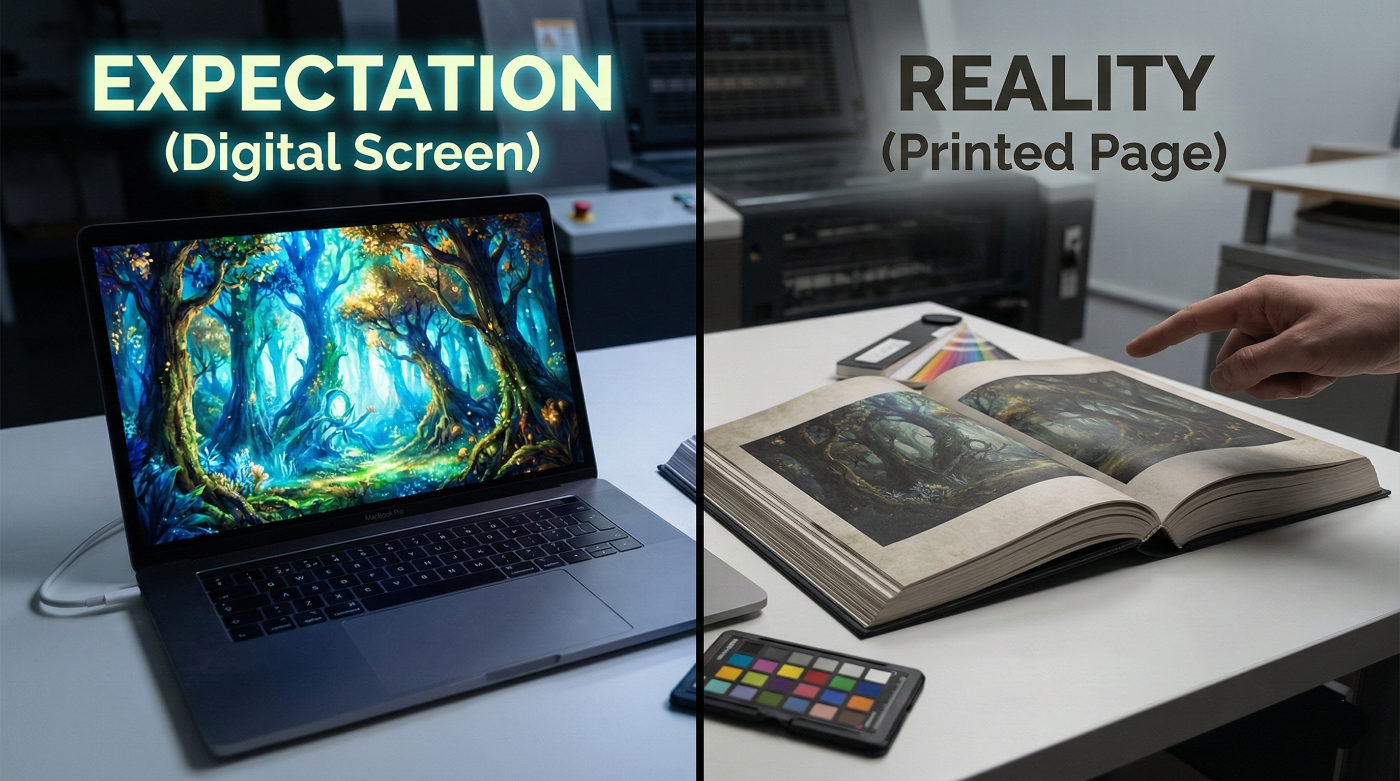
1. Relying on Screen Brightness for Color
The Mistake: Designing your book on a monitor set to 100% brightness.
The Result: Your printed book arrives looking significantly darker and muddier than expected.
The Fix: Screens are backlit; paper is not. Calibrate your monitor to a lower brightness level (typically 80-100 cd/m2) and use soft proofing in your design software. When in doubt, slightly brighten your mid-tones before sending files to print.
2. Ignoring the “Gutter” Loss
The Mistake: Placing important details—like a subject’s face or a line of text—in the center fold (the gutter).
The Result: Part of the artwork disappears into the binding, especially in thick hardcover books.
The Fix: Always maintain a “Safety Zone” of at least 15mm (0.6″) from the center fold. If you are doing a double-page spread, ensure the focal point of the image is safely on the left or right third of the page.
3. Using 72 DPI Images from the Web
The Mistake: Pulling images from your website or social media to use in your print layout.
The Result: Blurry, jagged pixelated edges that look unprofessional.
The Fix: Printing requires 300 DPI. Always go back to your original high-resolution scans or RAW photographs. If an image is 72 DPI, it needs to be roughly four times the size of your intended print area to be usable.
4. Forgetting the Spine Width
The Mistake: Designing a one-size-fits-all cover before choosing your paper stock.
The Result: The spine text ends up wrapping around onto the front or back cover because the book was thicker (or thinner) than planned.
The Fix: The thickness of your spine is determined by the number of pages and the GSM (weight) of the paper. Never finalize your cover art until you have a confirmed “Spine Width” calculation from your printer.
5. Standard Black vs. Rich Black
The Mistake: Using 100% Black (K) for large background areas.
The Result: Large black sections look like a washed-out, dark charcoal gray.
The Fix: Use a “Rich Black” formula (e.g., C=60, M=40, Y=40, K=100) for backgrounds to create a deep, velvety finish. However, keep your small text at 100% Black to ensure it stays sharp and legible.
6. Skipping the Physical Proof
The Mistake: Approving the entire project based solely on a digital PDF proof.
The Result: Discovering a glaring typo or a weird color shift after 500 copies have been printed.
The Fix: Always invest in a physical proof. It is the only way to feel the paper, check the “hand-feel,” and see how the ink actually interacts with the fibers of the stock.
7. Incorrect Page Counts
The Mistake: Submitting a file with an odd number of pages or a count that isn’t a multiple of four.
The Result: The printer has to add blank pages at the end of your book, which can disrupt your carefully planned layout.
The Fix: Most professional binding (like Smyth Sewn) uses signatures—sheets of paper folded into groups of 4, 8, or 16 pages. Ensure your total page count is a multiple of 4 to avoid unwanted blank pages.
8. Designing Too Close to the Edge (No Bleed)
The Mistake: Setting your images exactly to the trim line of the page.
The Result: Thin, distracting white slivers appear at the edges because the cutting blade shifted by a fraction of a millimeter.
The Fix: Add a 3mm (0.125″) bleed to all outer edges. Your artwork should bleed off the page so the blade always cuts through ink, not white paper.
9. Choosing the Wrong Binding for the Page Count
The Mistake: Choosing Perfect Binding (glue) for a 400-page art book.
The Result: The book is difficult to open, and the spine eventually cracks under the weight of the heavy art paper.
The Fix: For thick art books or those using heavy paper, Smyth Sewn is mandatory. It allows the book to lay flat and provides the structural integrity needed for a heavy coffee table volume.
10. Lack of Consistency in Image Editing
The Mistake: Editing images individually over several months without a unified look.
The Result: Some pages look warm and yellow, while others look cool and blue, making the book feel disjointed.
The Fix: Once your layout is done, do a final color pass. View your pages side-by-side in your software to ensure that the skin tones, whites, and blacks feel like they belong to the same family.
Conclusion: Your First Book Should Be Your Best Book
Everyone makes mistakes, but in the world of art book printing, mistakes can be expensive. By paying attention to these ten areas, you are already ahead of 90% of first-time self-publishers.
At ArtBook Printing, we see our role as more than just ink-layers. We are your safety net. If we see a file with no bleed or low-resolution images, we’ll stop the presses and work with you to fix it. Because your success is our reputation.